I want – I got favourites complexgeometries and Jason Last have teamed up to create a new full length film called The King’s Son. This video is a short teaser and it looks amazing. Watch this space as this full film will be released soon and I’ll definitely will be posting it.
Latest Posts
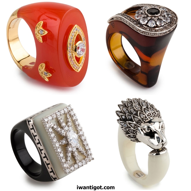
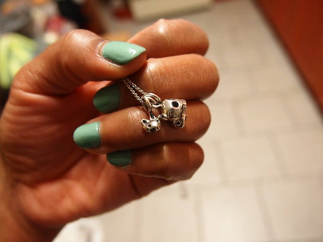
i want: Miriam Salat Rings
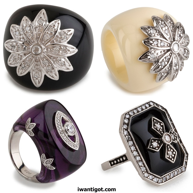
I love these Miriam Salat Rings. These brightly coloured resign rings use sterling silver and cubic zirconias in their settings.

You can find Miriam Salat jewellery online at miriamsalat.com
Sacai Fall Winter 2011 – 2012 Video
I loved the Sacai Fall Winter 2011 – 2012 collection and I found a video of the presentation. The textures and juxtaposition of styles is what makes Sacai so amazing.
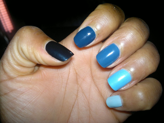
i got: Fall Winter 2011 – 2012 Nail Binge: NARS, Dior, Chanel
I’ve had some fun buying some of the Fall Winter 2011 – 2012 nail polish options.
NARS
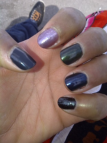
Left to Right: Galion, Night Rider, Night Porter, Night Flight, Night Breed
NARS is one of my go to nail polish brands. It has a beautiful, slick finish and with a nice brush. The polish wears well for me too.   I got the entire Night Series collection (Night Rider, Night Porter, Night Flight, Night Breed) because I couldn’t choose. The Night Series collection is based on the iconic NARS Night Series Eyeshadows.  I also had to have the Fall 2011 colour, Galion.
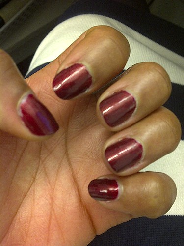
Chanel
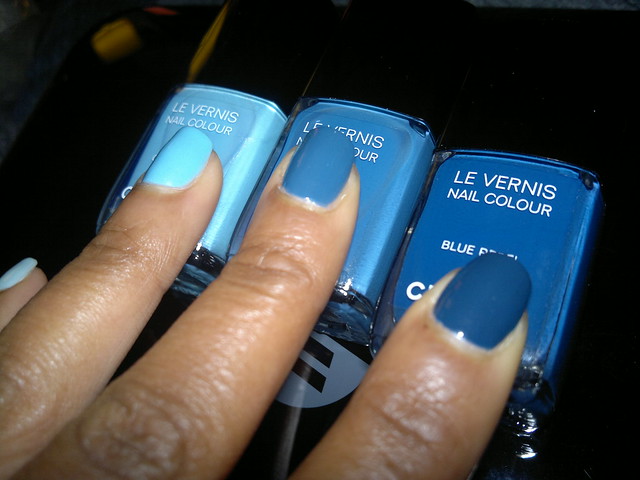
Left to Right: Chanel Coco Blue, Chanel Blue Boy, Chanel Blue Rebel
I got The Oracle to pick me up the Les Jeans de Chanel colours that were limited edition for Fashion Night Out 2011. I had Melissa from Tips Nail Bar to incorporate them into a great blue gradient manicure because I couldn’t choose just one to wear.  I love Chanel nail polish it wears very well and has staying power.
Left to Right: YSL Moonlight Blue, Chanel Blue Rebel, Chanel Blue Boy, Chanel Coco Blue, Chanel Riva
Dior
I saw Apparat, the new limited edition Dior Nail Lacquer for Holiday 2011 on my new favourite beauty site Temptalia. The photos on Temptalia looked so good.  Apparat is a gorgeous ruby colour with a hint of gold.  I immediately started a twitter search to find it.  With the help of the Hudson Bay twitter account, I found Apparat at the Queen Street flagship store.
The Black Cat Ball – November 12, 2011
The Black Cat Ball – November 12, 2011 .

BLACK CAT BALL Worn Fashion Journal ISSUE 13 LAUNCH PARTY
WORN Fashion Journal is launching its ominous issue 13—a purrrfect occasion to laugh in the face of superstition with a BLACK CAT BALL.
WHAT and WHEN
On Saturday, November 12, WORN Fashion Journal will get your inner kitten out of the alley and onto the dance floor with our BLACK CAT BALL.Tease fate dressed in your black-and-white best.
If luck is a lady (or at least not a jerk) you’ll get a shot at a whole bunch of prizes in our raffle—tip the scales with extra tickets for just $1. Want to mask your feelings? Our on-site face-painters promise supernatural sauciness. And when you’re done with the madness, move onto the magic. We predict you’ll get your whiskers in a twist with an eclectic mix of highly danceable oldies and favourites with WORN’s own Teddy the K.
HOW and WHY
Bring out your best ball style in black and white and watch as fashion comes on little cat feet. Bring a date or just walk on your wild lone.FEATURING RAFFLE PRIZES FROM
Lara Vincent
Fieldguided
Miracle Thieves
Robber
Common Sort
Scarffaces
Squab
Sam James Coffee Bar
…and more!WHERE and FOR HOW LONG
Dovercourt House805 Dovercourt Rd, Toronto
Scratch at the door: 9:00 PM
Meow for a taxi: 2 AM
ADMISSION PRICE – $12Includes admission and a dangerously delicious copy of WORN Issue 13
ADVANCE TICKETS $10 – AVAILABLE AT www.wornjournal.comDRESS CODE
Black and White Dress desired but not required.

i want: Banjo and Matilda Fall Winter 2011 Striped Sweaters
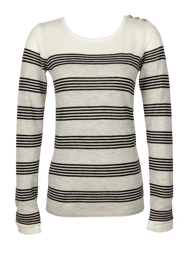
I’m attracted to striped sweaters this winter. This fixation is primarily for the Breton stripe variety. Right now, the Holy Grail of all Breton stripe sweaters would be to own a Jean Paul Gaultier original but these Banjo and Matilda cashmere ones will be just fine.
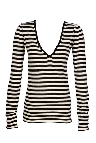
Banjo and Matilda sweaters are available at Holt Renfrew.
images: courtesy of Banjo and Matilda
I want – I got’s Spring Summer 2013 Fashion Trend Forecasting Reference – Updated May 12, 2012

COLOR PREVIEW SPRING 2013 MENS REPORT TRENDSTOP.COM<
I want – I got’s Spring Summer 2013 Fashion Trend Forecasting Reference
This is a listing of fashion trend forecasting reports for Spring Summer 2013. They are posted for reference and easy access. This page will be updated as more fashion trend forecasting reports come up.
New – WeConnectFashion Trends| WOMEN'S CAREER APPAREL S/S 2013 TREND MPDCLICK.COM
WOMEN’S TREND FORECAST S/S 2013. TRENDSTOP.COM
KID’S APPAREL S/S 2013 TREND REPORT. MPDCLICK.COM
MENS TOP COLOR SPRING 2013. FASHION SNOOPS TREND REPORT
KID’S COLOR TRENDS S/S 2013. DESIGN OPTIONS
WOMEN’S COLOR TRENDS S/S 2013. DESIGN OPTIONS
Lenzing Interior Trends 2013: Bed/Bath/Lounge
Spring/Summer 2013 Trend Forecast by Cotton Incorporated
Lenzing Trends Spring/Summer 2013
Pantone View Color Planner Spring/Summer 2013- Unity & CO
WOMEN’S TOP 5 TREND THEMES SPRING 2013 FASHION SNOOPS
WOMEN’S APPAREL S/S 2013 NEW RENAISSANCE TREND MPDCLICK.COM
COLOR PREVIEW SPRING 2013 WOMEN’S REPORT TRENDSTOP.COM
WOMEN’S MENS TEXTILE & COLOR S/S 2013 TRENDS LENZING
Active Spring Summer 2013 Trends by Cotton Incorporated
Lenzing – Textile Fibers – Trends Spring/Summer 2013
WOMEN’S MENS TEXTILE & COLOR S/S 2013 TRENDS LENZING
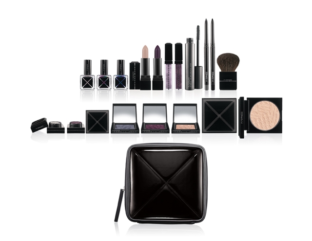
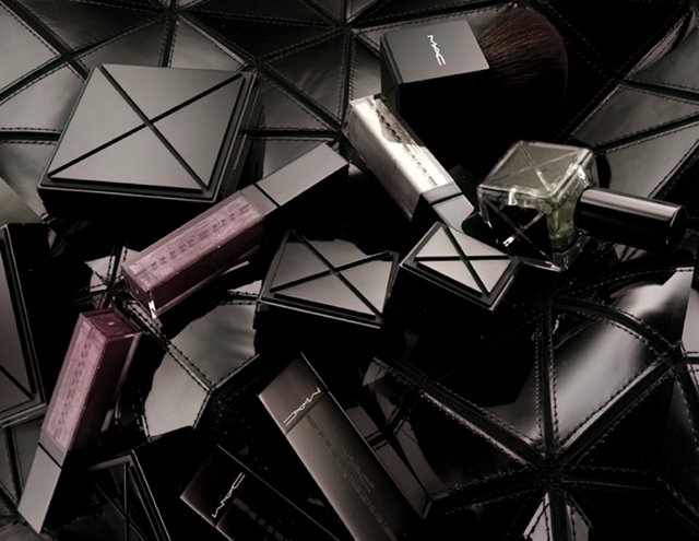
Gareth Pugh x MAC
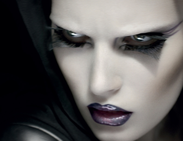
MAC has teamed up with Gareth Pugh for their next makeup collaboration. It’s pretty damn cool looking.
To think Gareth Pugh is to think beautifully distorted, sculptural, otherworldly proportions… avant-garde mash ups of materials (from PVC and Perspex, latex to leather, mink to metal, Gareth reworks them all into breathtakingly original clothes)…an extreme attitude… In short, no one could accuse Gareth of being conventional. Or predictable.
Cue heavyweight geometric packaging encasing some seriously chic standouts: a duo-chromatic nail polish that flashes from emerald to amethyst. A compact Beauty Powder that turns all skin-tones a sophisticated matte. Lipglasses that go from super-subtle (worn alone) to statement-making when layered over Lipstick. Lashes that redefine the shape of what a fake lash could, or should, be…
“They’re about contradiction and the struggle between lightness and darkness,†says Gareth of how he creates his inspired collections. So too his debut approach to makeup. Every piece is unique, experimental, precious and intriguing (just like Gareth’s designs)…and ready to be played to your lighter (more ethereally natural) or darker (sinisterly sophisticated) side.

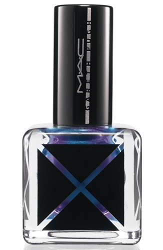
As usual the nail polishes are what I’m gravitating to. It would be nice if they included some swatches as the images provided don’t show enough of the polish. The metallic polishes remind me of holograms. The 3 colours are Inert (Creamy midtone greyed nude), Ascension (Grey with blue violet reflective pearl) and Hyper (Deep blue with violet pearl). Each polish costs $27.50.

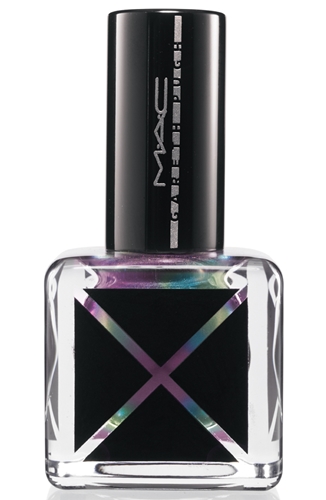
Fervent, Ascension
I like the lipstick and lipglass options. Fervent (Glossy blackened berry) is a satin finish lipstick and cost $27.00. I like both lipglass colours. Vacant (Sheer light lavender grey with violet pearl) and Outrage (Sheer light lavender grey with violet pearl) both cost $27.00.
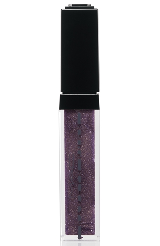

Outrage, Vacant
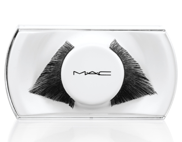
I’m very excited about the eyelashes. The geometric shape are so crazy looking. The lashes cost $21.50. The MAC staff will apply them for you to when you purchase. Perfect for those of us that suck at applying false lashes.
The press kit included a Q&A with Gareth. I’ve posted some of the questions I found interesting.
MAC – HOW DID THIS COLLABORATION WITH M·A·C COME ABOUT?
Gareth – M·A·C have supported me since my first show and are such a great company to work with, so when they came to me with the idea of doing something collaboratively I was obviously very interested. Initially, the idea was to create makeup products linked to a particular catwalk show, where they would come backstage and take colour swatches from what we used on the catwalk and then create products from that. But I wanted to do something much more specific, something that distilled my aesthetic in a wider sense than just being about one particular season – something that was a complete package.
MAC – THE PACKAGING IS AMAZING, GIVING THE COLLECTION A REAL 360 DEGREE GARETH PUGH FEEL…DID YOU INSTIGATE THIS?
Gareth – Yes, it was really important to me that the collection we did together was more broad ranging than just being about the colour or texture of the makeup – I understand that that’s obviously one of the most important aspects of course, but I wanted it to encompasses great packaging too so it wasn’t only about the product inside. I just feel that it gives the whole range a much more special feeling – I think it all looks very ‘me’ and very slick – M·A·C did a really great job on it!
MAC – HOW DID YOU EMBARK ON THE CREATIVE PROCESS THEN?
Gareth – To start the ball rolling, M·A·C asked me to send them some references for the various products… basically, anything that I liked the finish, colour or texture of. I had a very clear idea of what I wanted the collection to be and was able to put together a very concise reference board made up of a lot of things that I love and have kept in my studio for years for one reason or another – I never throw anything away! There was fabric in there from previous collections, a feather from some head pieces I made for my Spring/Summer 2010 show, a hematite coloured rock that I’d brought at this amazing shop called Evolution in New York, a butterfly wing that someone had given me in Paris…an amalgamation of things that I’d kept because I like them, and this was the perfect opportunity for me to use them.MAC -THE LASHES REALLY STAND OUT: TELL ME ABOUT HOW YOU DESIGNED THESE?
Gareth – The idea with the lash was my way of getting something very graphic into the actual product. I just took a load of the biggest lashes that M·A·C makes and started chopping them up into different shapes. The thing with lashes is that they tend to be a very ‘lash’ shape whereas I wanted to do something that looked more non-conventional and angular: not something you tend to see a lot with lashes. From shooting our video and seeing how they work on the film, I really feel that these triangular lashes make the eyes look very beautiful. Worn top and bottom, they give this very angular, horse blinker, effect. Fake lashes can be very referential of old Hollywood and film noir glamour whereas I wanted to do something that was much more fresh and modern looking.
MAC – HOW DID YOU WORK ALONGSIDE PRODUCT DEVELOPMENT?
Gareth – There was a lot of backwards and forwards between us – I was being very specific! I don’t use a great deal of colour in my work but I knew it was incredibly important with this to get it right – it’s sort of the most important aspect of the collaboration really, and it had to work together as a collection. The end result was worth all the tweaking: everything is going in the same direction and singing from the same song sheet – it’s very satisfying to see it all come together.
I think the collaboration has done a great job of translating the Gareth Pugh aesthetic. The collection hits all North American MAC stores on November 23, 2011.
images: courtesy of MAC
i got: Elaine Ho Jewellery
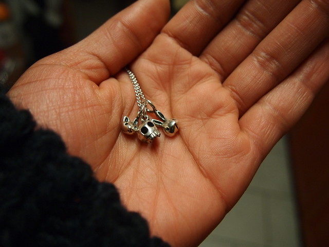
I bought the cutest pendants from Montreal based, Elaine Ho at The Coveterie 24 hrs Boutique. I have a strong love of all things cute and round so I purchased three pendants: a cat, bunny and skull.
You can find Elaine Ho Jewellery at:
Labour of Love
242 Carlton Street
Toronto
Propaganda
686 Yonge Street
Toronto
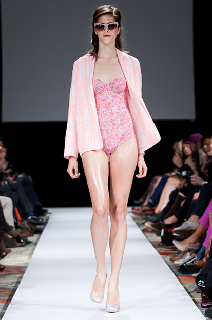
the shOws – CALLA Spring Summer 2012
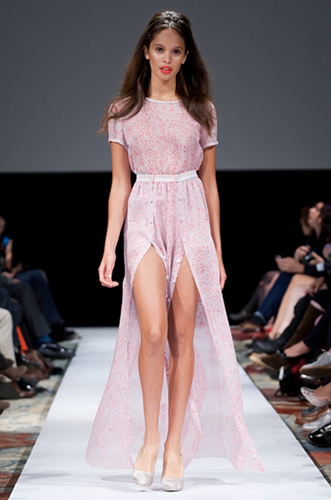
CALLA is one of the four designers that showcased their Spring Summer 2012 collections with the the shOws at the Ritz-Carlton. the shOws is the brainchild of Paola Fullerton.
“Our aim is to put the spotlight on Canadian Designers, Hair and Makeup Artists and Models and build a property that benefits not only our designers, artists and retailers but also our supportive sponsors, by showcasing the very best of Canadian talent at home and abroad to our media, buyers and stylists.
The purpose of The ShOws is to bring together our most talented and creative Canadian designers each season and allow them to present their collections here in Toronto to the fashion industry without incurring any production costs themselves. We want to support them here at home and give them every possible opportunity to continue to build their brands.” – Paola Fullerton, Founder & Creative Director
Calla Haynes continued her digital print mastery and delighted the crowd with a collection that sat perfectly on the edge of femininity without being too saccharine. The inspiration for Spring Summer 2012 was translating the feeling of being at a festival and hearing great music into prints and colour. The collection played with different colours and prints as well as textures. Tweed contrasted with marble like digital prints.
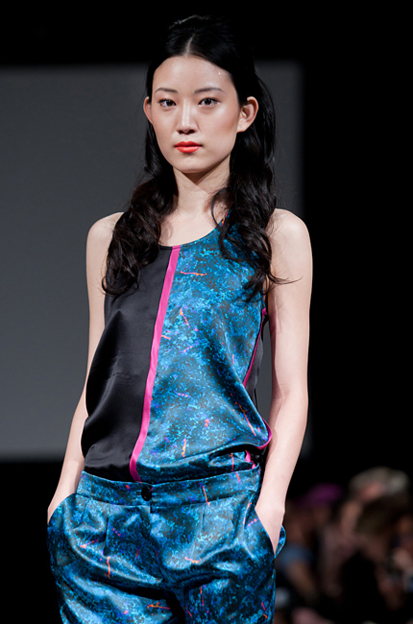
Full collection photos for Calla Haynes’s Spring Summer 2012 on torontolife.com.
The CALLA Spring Summer 2012 collection also made it’s first debut on Style.com. The video on style.com gives you a close up of the prints and different textures in the collection that my video can’t provide. It’s these details that make the collection so special.
Image: Jenna Marie Wakani